Selecting eye-catching covers to turn face-out is a crucial part of library merchandising. The next stage is to make individual titles look good together.
Bookshops can stack multiple copies of the same book to make an impact. In libraries we never have lots of multiple copies – if the book is popular enough to justify multiple purchase that means it is popular enough to be mostly out on loan or in a reservation queue.
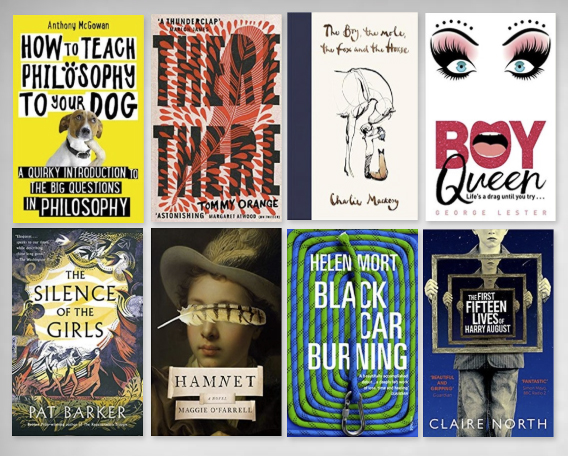
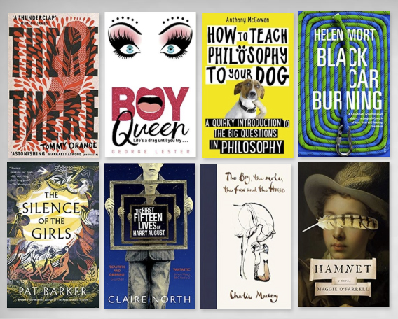
Individual books need to be perceived as separate entities and the key principle here is contrast – warm/cool, simple/busy, light/dark. Here are the 8 titles we chose for the Take a chance theme. Notice the visual problems create by the lack of contrast – the books shade into one another and you can’t tell where one finishes and another begins.